Introduction
The Medplum App is a user-facing web application available at https://app.medplum.com/ and is targeted towards developers and project administrators. This administrative app is developed from the Medplum React Components, meaning that many of these views and functionality can be embedded into your own custom apps.
This guide will go over how to navigate the basic functionality of the Medplum App.
Homepage
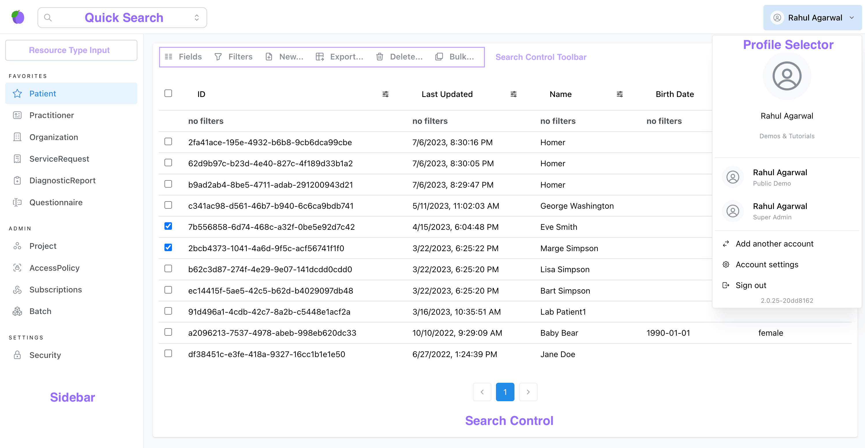
When you first log in to the Medplum App, you'll see the page shown above. This home page consists of a few primary components:
- Search Control - Displays a list of the currently selected resource type.
- Sidebar - Used to select the current resource type and quickly navigate to different parts of the Medplum App.
- Quick Search Bar - Used to search for specific resource instances.
- Profile Selector - Displays profile information for the currently logged in user.
Search Control
The Search Control displays a paginated list of all the resources for the selected resource type. You can select individual resources for certain operations using the checkbox on the left hand, and you can select all resources on the current page by clicking on the checkbox in the table header.
The toolbar at the top contains actions that you can use to customize this view.
-
Fields: Can be used to add/remove columns for resource elements
-
Filters: Used to filter rows based on search criteria. Only elements with search parameters can be filtered on. You can also use the filter icon at the top of each column to filter on a specific element. Refer to our search guide for more information.
-
New: Create a new resource of the selected type. This will open a form to specify the fields of the newly created resource, with the * character indicating required fields.
noteThis form is an instance of the
ResourceFormReact component, and can be embedded into your own applications. -
Export: Export the resources in the current view, either as a CSV or as FHIR Bundle.
noteThis operation will export all resources for the selected filters, not just those on the current page (up to a maximum of 1000 resources).
-
Delete: Delete the selected resources. You can perform a bulk delete by selecting multiple resources at once.
-
Bulk: Execute a Medplum Bot on all selected rows.
This search control is also encapsulated as the Search Control React component and can be embedded into your own applications.
For performance reasons, the total resource count displayed on the Medplum App is an estimated count, not an exact count. You can read more about fetching resource counts here
Sidebar
The sidebar is used to quickly navigate to different parts of the Medplum App.
You can show/hide the sidebar by clicking the plum icon in the top-left corner.
By default, the sidebar is populated with shortcuts to common resources, but you can use the Resource Type Input to navigate search for any FHIR resource type.
The sidebar also contains links to administrative pages, including:
Quick Search Bar
The Quick Search Bar can be used to navigate to specific instances of ServiceRequest or Patient resources, which are two of the most common resource types. This search bar searches the following search parameters:
Patient.idPatient.namePatient.identifierServiceRequest.idServiceRequest.identifier
Profile Selector
The profile selector can be accessed by clicking the arrow next to your name on the top-right corner of the screen.
By clicking "Switch to another project", users can be log into multiple projects simultaneously. The profile selector will display all projects that the user is currently logged into so that users can quickly switch between projects.
"Account Settings" can be used to navigate to the user's profile resource page.
Lastly, the profile selector contains the application's current version number (e.g. 2.0.25-427e07af), which can be useful information when troubleshooting.